01
Tone
Sleek and polished for a modern fintech audience, bold enough to set the fund apart from a standard VC site.
01 / Selected work
Index 13 / 19
Creative Development · 2025 · Venture capital, B2B SaaS and fintech
View live site02 — Why it existed
Context
Defiant describes itself as Europe’s first VC firm engineered like a technology company: thematic, data-driven and focused on B2B SaaS and fintech. It ships tools for founders, not just cheques.
The site had to say that without a pitch deck: calm, exact and a little defiant, with the products and the writing carrying the weight.
03 — The brief
01
01
Sleek and polished for a modern fintech audience, bold enough to set the fund apart from a standard VC site.
02
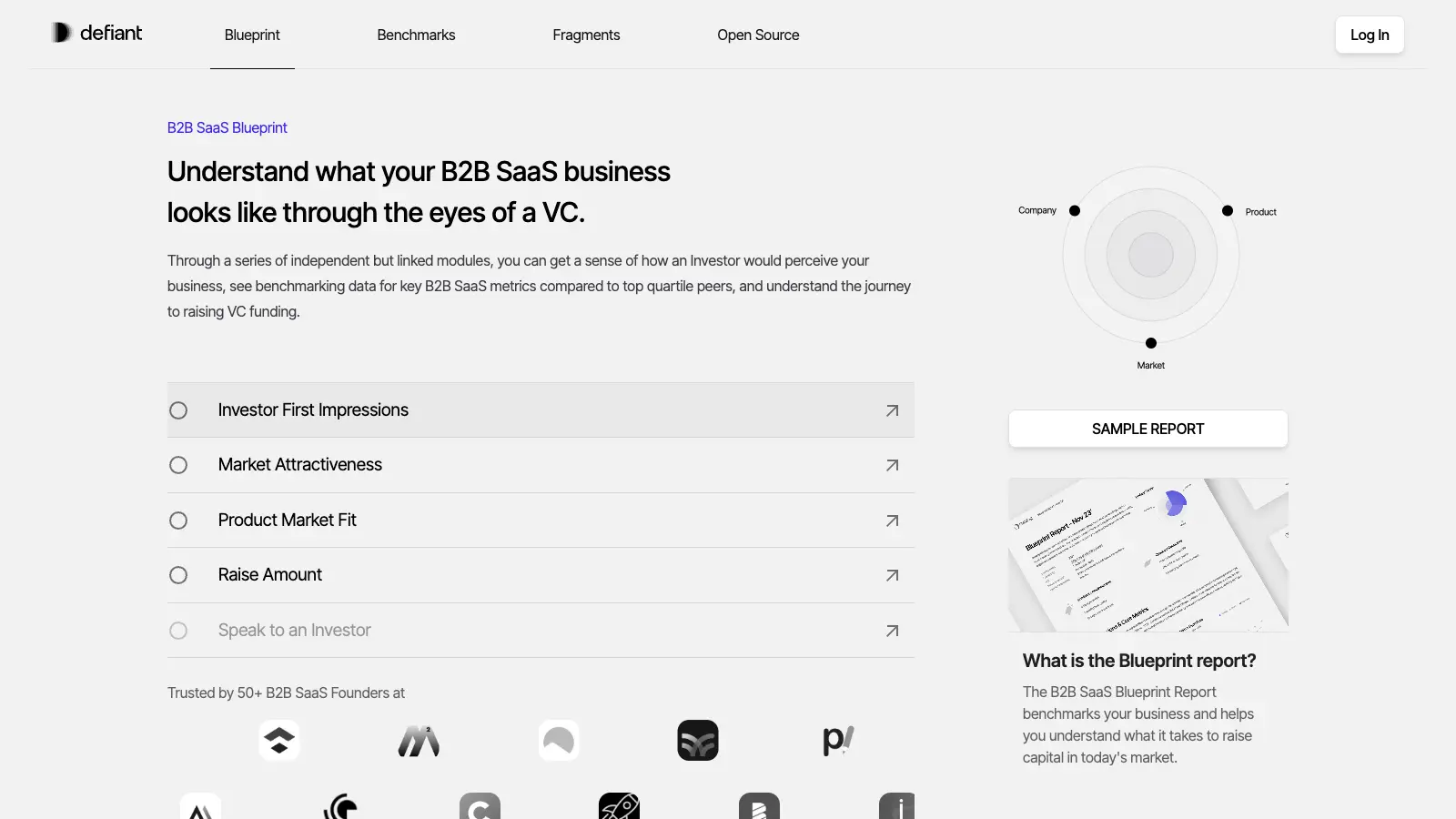
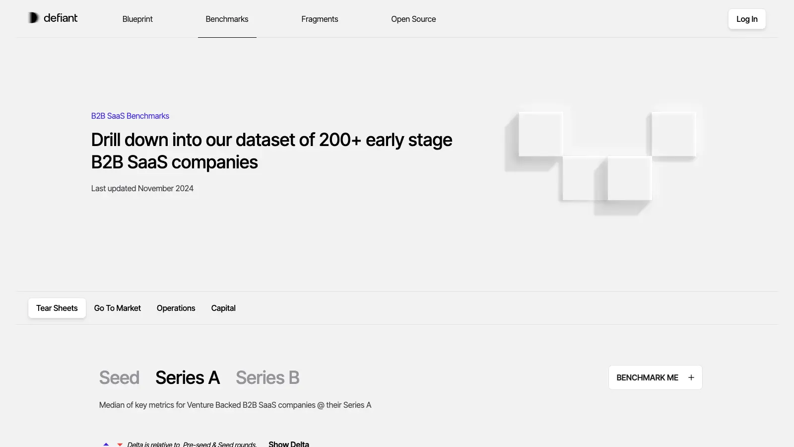
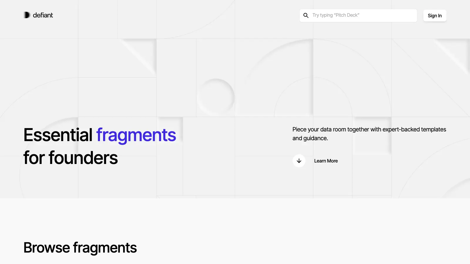
Blueprint, Benchmarks, Open Source and Fragments are real tools, so they get a stage instead of a footnote.
03
Perspectives is how the fund thinks in public; it had to read as quietly as the rest of the page.
04 — First encounter
Smoke · statement
01 — We seek out the defiant ones
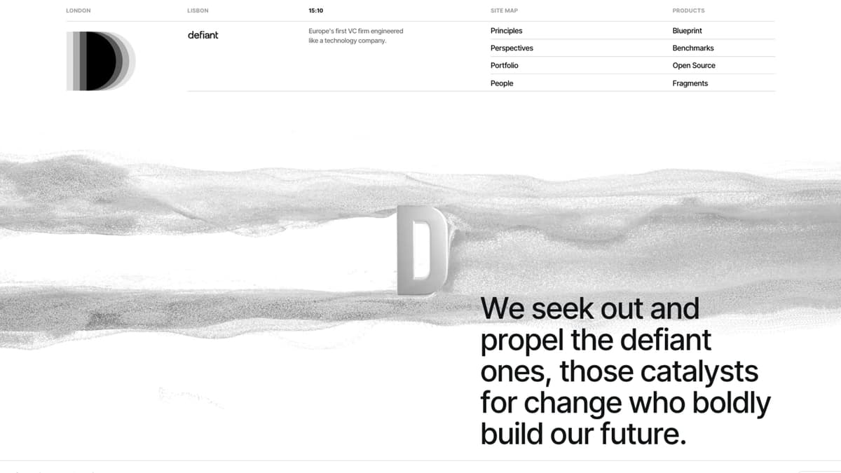
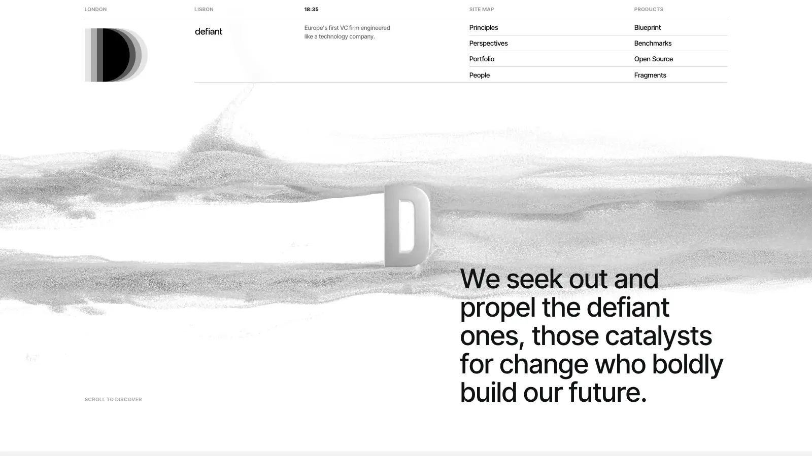
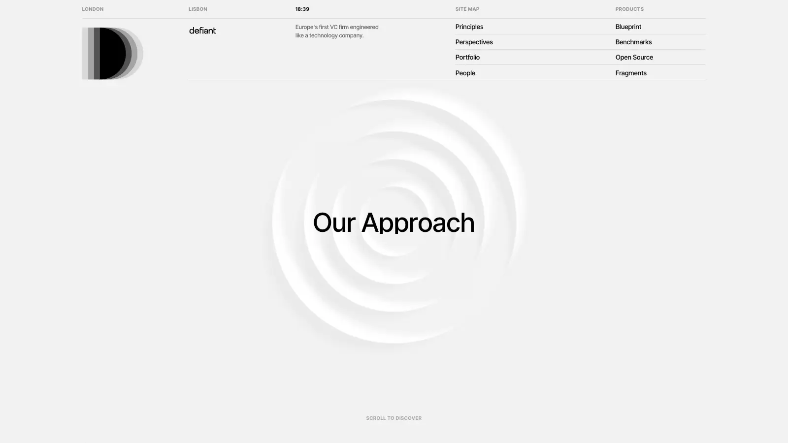
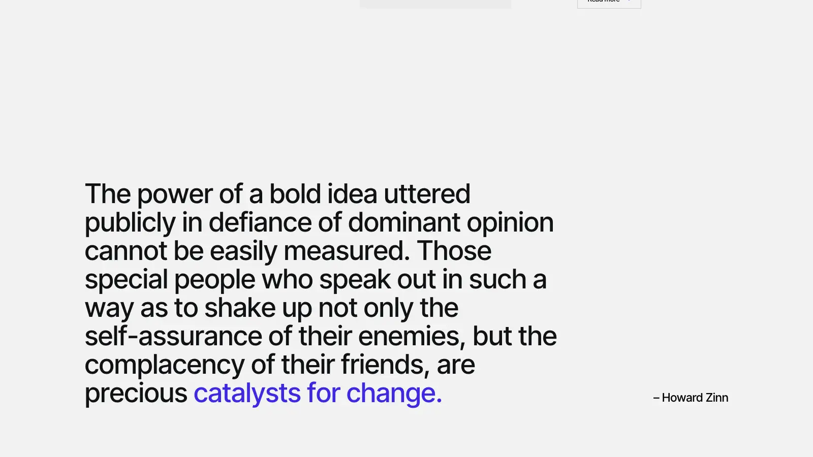
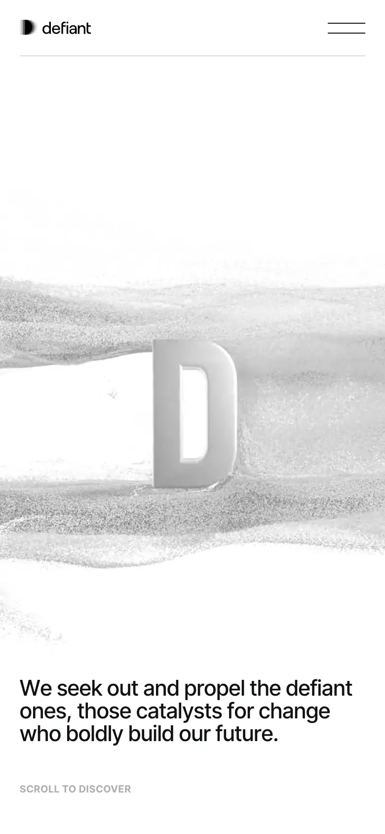
The first screen is almost empty: a nav that reads like a table of contents and a drift of grey smoke running behind a single sentence.
The smoke is a video, so it can move like liquid without a heavy scene behind it. The type stays still and does the talking.
05 — The idea
Creative logic
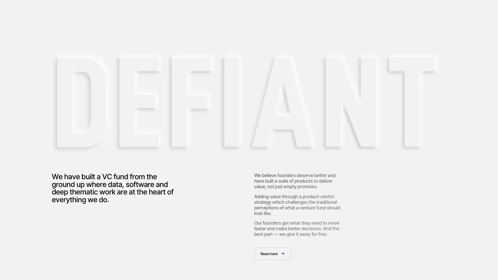
The whole site is pale grey and white. Depth comes from an embossed D, soft ripples and light shadows, so the surface feels pressed rather than painted.
Motion is the same: slow, short and restrained, so the data and the writing stay readable.
01 — Statement
One sentence over the smoke.
02 — Products
A pinned stage that steps through three tools.
03 — Thesis
The fund’s approach in two short paragraphs.
04 — Perspectives
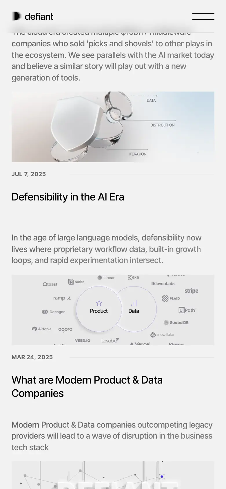
Writing as a quiet list with previews.
06 — Motion system
Values from the bundles
07 — Inside the build
One page, five systems
Layer 00 — Surface
Move across the plate to X-ray it
A streamed smoke video sits under the opening statement and the nav.
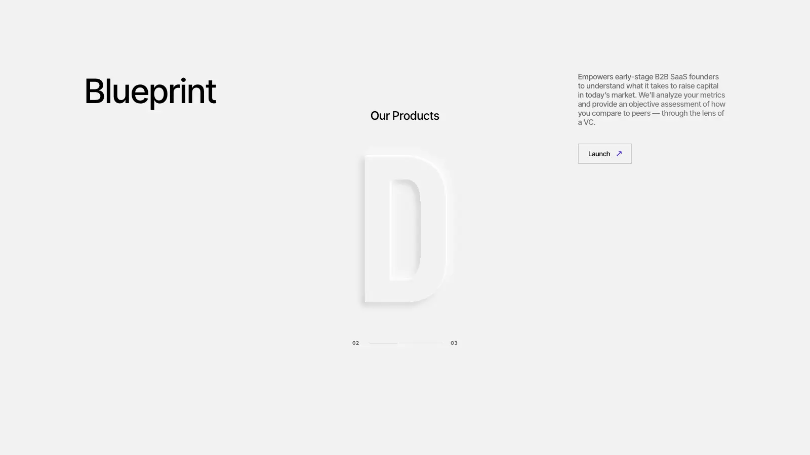
A pinned stage steps through Blueprint, Benchmarks and Open Source, with a progress line.
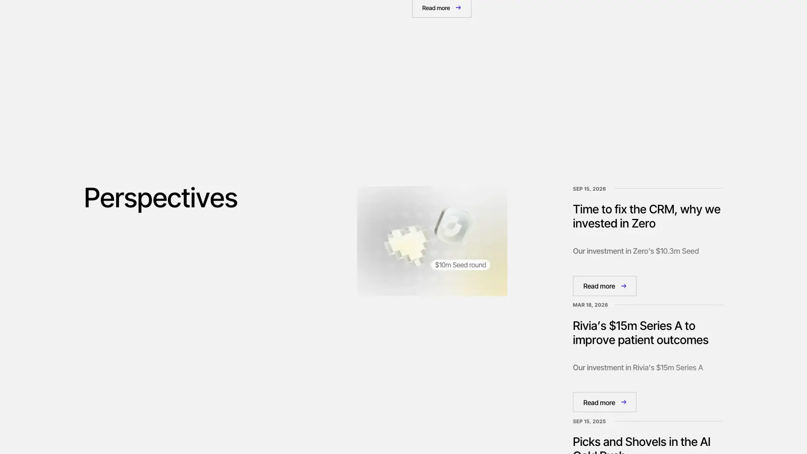
Posts appear as a quiet list with dates, previews and a read-more link.
Moving between pages shows a ripple on a pale surface and the destination title.
Lenis smooths the scroll and the pinned stage reads from it.
08 — The product pin
Where the page holds
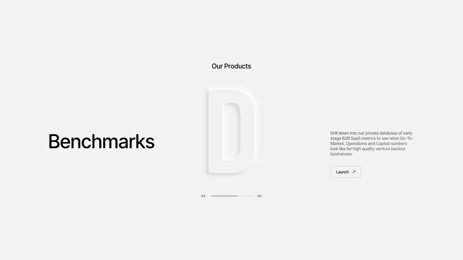
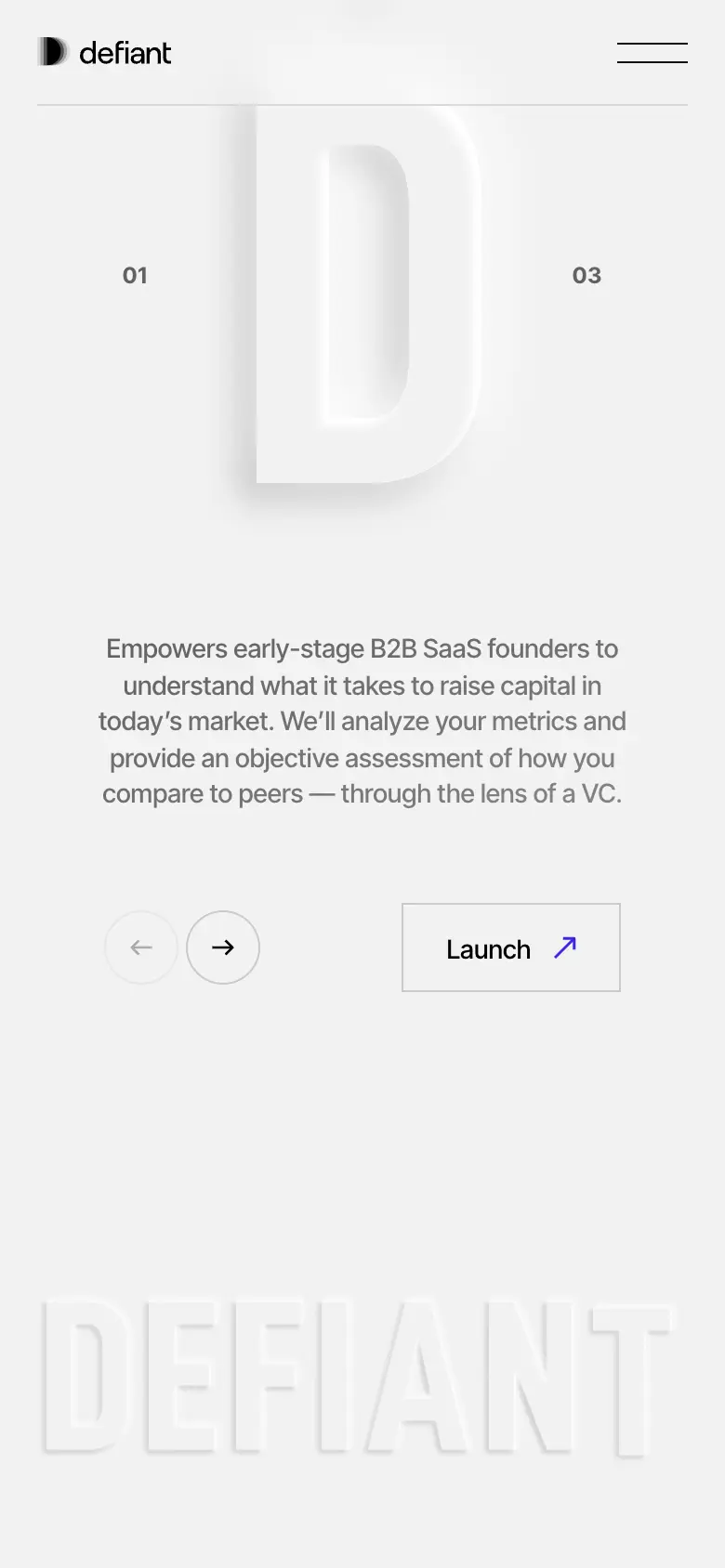
Our Products pins to the screen and steps through Blueprint, Benchmarks and Open Source. The same embossed D stays centred while the title, the paragraph and the Launch link change around it.
A thin progress line and a 01 to 03 count tell the visitor where they are in the sequence.
09 — Responsive
Recomposed, not scaled
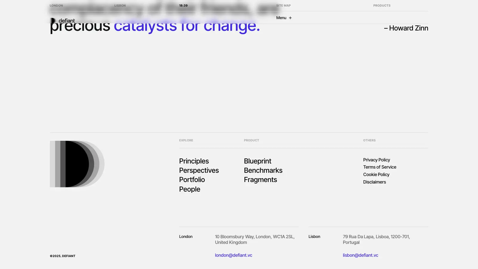
Wide nav as a table of contents, the pinned stage and the list.
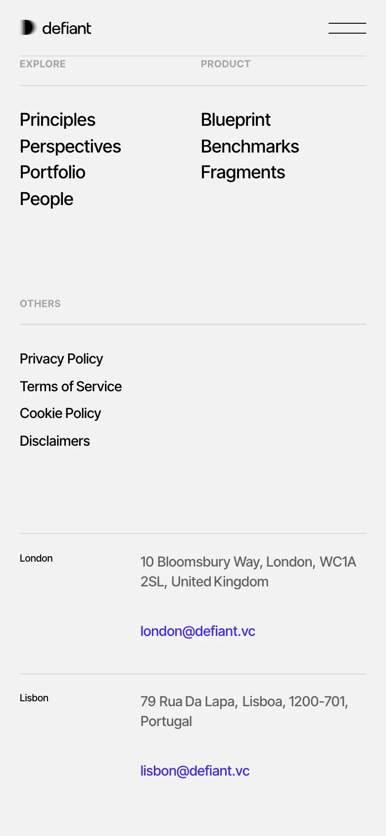
The wide table-of-contents nav becomes a menu icon.
Previous and next buttons step through the product stage.
Products and perspectives stack in reading order.
10 — Performance
Decisions, not dashboards
No lab scores are claimed for this page; none were measured here. These are decisions observed on the live site.
The home page draws no canvas. The smoke is a video and the depth is in the images.
A single streamed video plays on the home page rather than several.
The code ships in many small chunks, so a page loads what it needs.
Most moves use one ease at 0.6 s, so the motion reads as a single system.
11 — The result
Evidence, not the objective
The site, screen by screen
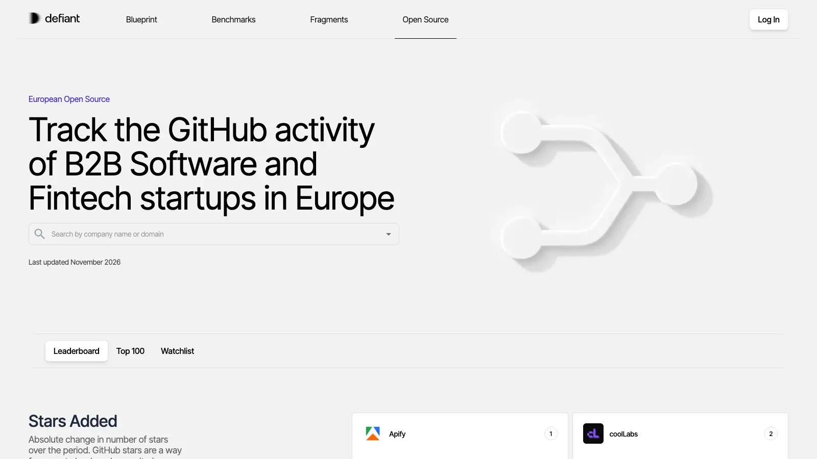
And on a phone


12 — Built together
Who did what
13 — My role
Exact responsibilities
Next.js pages and components.
The reveal grammar, page transitions and the pinned stage.
Lenis smooth scrolling wired to GSAP.
14 — Technical index
Hover a technology
Recorded on the live site
Moments, in motion
15 — Final experience
defiant.vcNext / 14
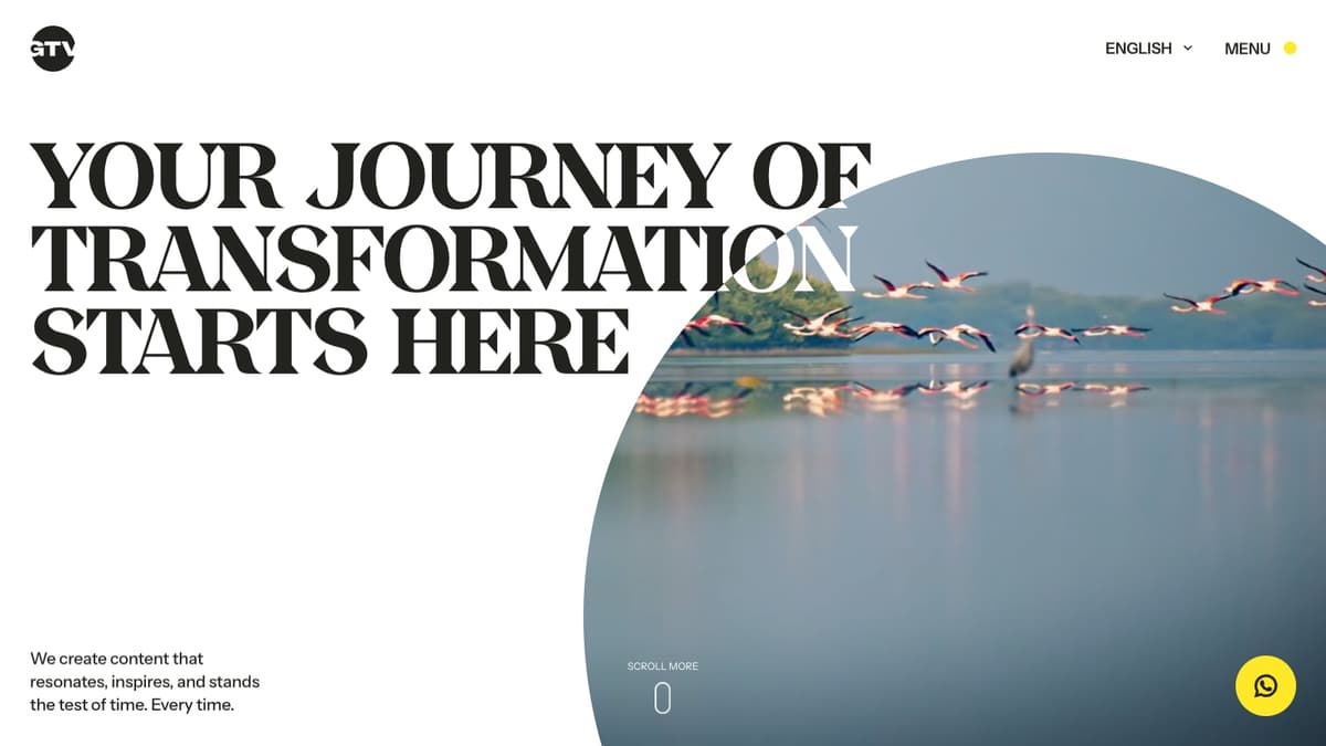
A cinematic, motion-led home for a production house’s reel.
Film Production · United Arab Emirates · 2025
17 — Start
Studios · brands · founders