01 / 03 — Studio · 2026
Editorial / cinematic
From Another
Turning an editorial identity into a website that moves like a film.
A GSAP motion system, WebGL kept to the cinematic image transitions, and a headless content layer the studio can edit.
Creative development / 001
I turn ambitious design into fast, responsive, production-ready digital experiences — motion, WebGL, CMS and all the engineering underneath.
GSAP · WebGL · Next.js · 11+ years · Worldwide
02 — The difference
Front-end development
Make the interface work.
Creative development
Make the interface work, move and feel like the design intended.
It is the layer between design intent and production reality — where a Figma file becomes something that scrolls, reacts and renders on a real phone, without anyone quietly simplifying it on the way.
03 — The system
06 layers
React / Next.js / semantic DOM
Grid, type and semantic blocks — the flat layer everything sits on, and the one search engines and screen readers actually read.
Layout survives every viewport
Re-composed for tablet and phone, not shrunk. The idea stays; the arrangement changes.
GSAP / ScrollTrigger / interaction
Curves and timelines drawn on the layout, not after it — one timing grammar from the hero to the footer.
WebGL / R3F / shaders
Mesh and shader passes, sized to a frame budget and used only where the DOM can’t tell the story. The specialist version of this layer: WebGL / Three.js.
CMS / API / localization
CMS blocks and API nodes wired into components, so the team edits the site without breaking the motion.
Performance / accessibility / deployment
Budgeted from the first commit, not audited after launch: frame budget, reduced motion, lazy media, deploys that don’t drift.
04 — When you need it
Symptoms, not technologies
05 — Design → browser
Mat Voyce · with Uncommon Studio
01 / 06
A static frame: exactly what was designed, at one width, with nothing moving yet.
Exactly what was designed, at one width, with nothing moving yet.
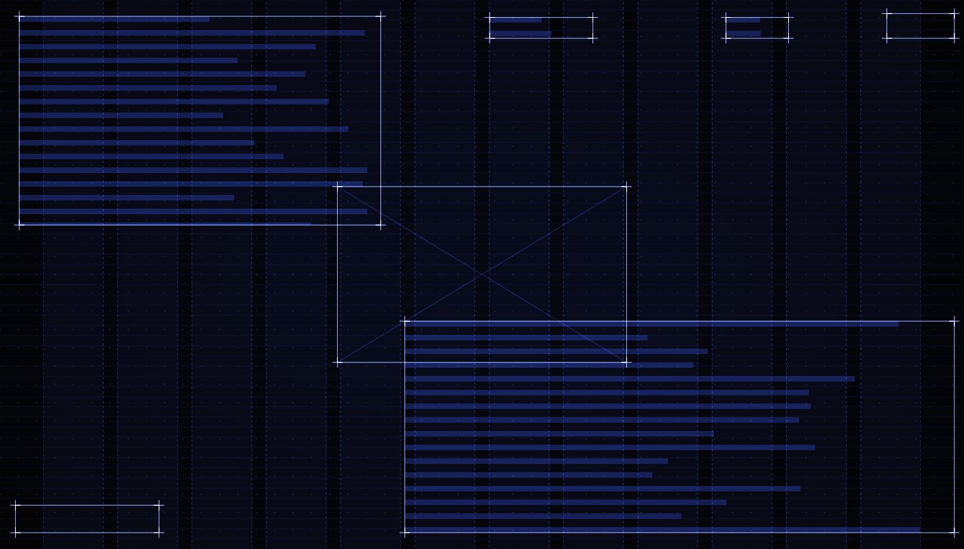
The frame becomes a grid and a set of blocks that re-compose for every viewport.
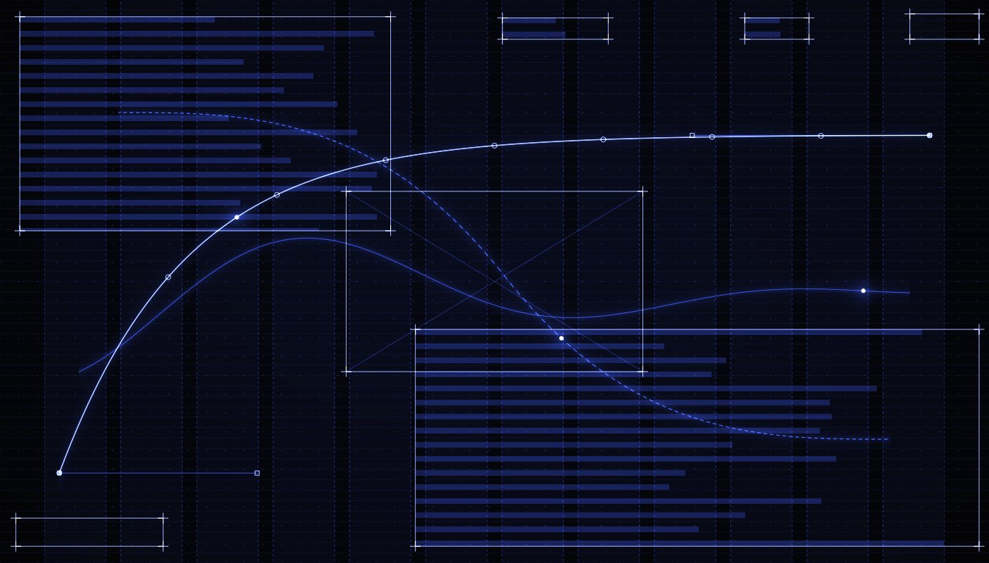
Timelines drawn on the layout, so movement follows the hierarchy.
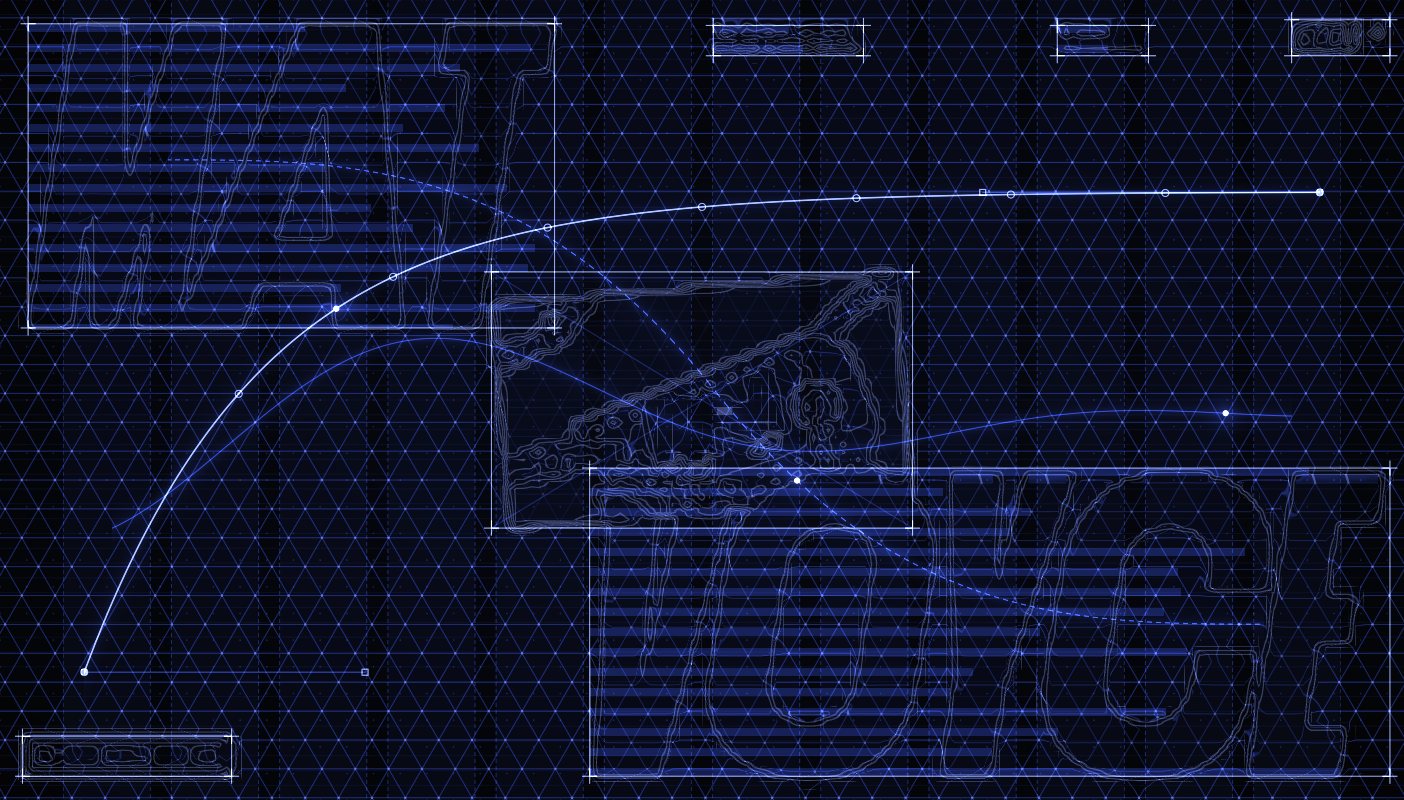
Rendering only where it earns its weight, sized to a frame budget.
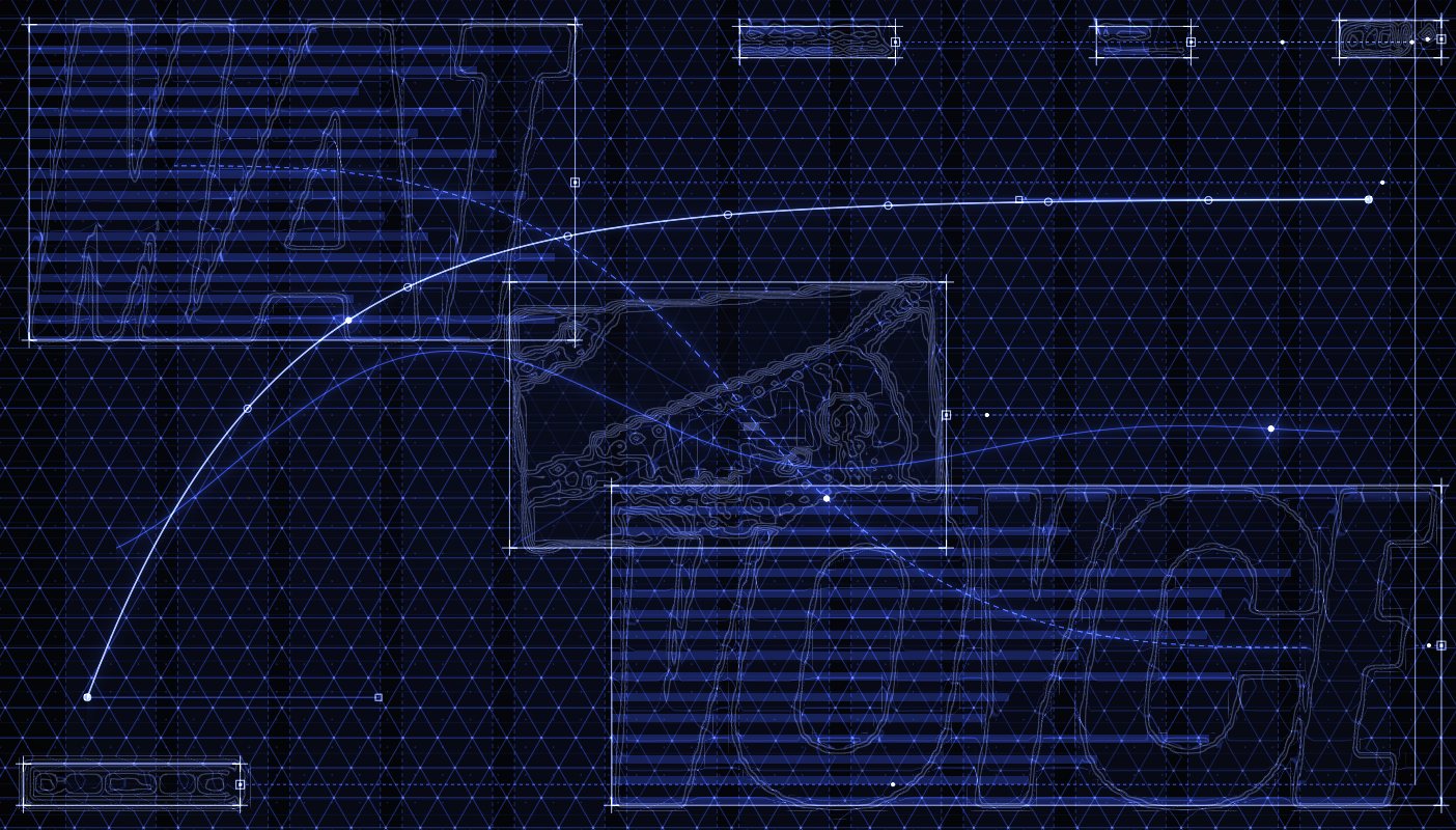
Content wired into components, so the site stays editable after launch.
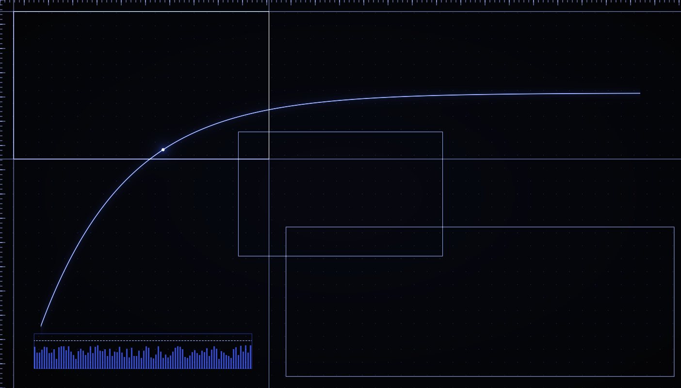
Every layer simplified until it holds up on a real phone — then shipped.
06 — Selected proof
03 projects · 03 dimensions
01 / 03 — Studio · 2026
From Another
Turning an editorial identity into a website that moves like a film.
A GSAP motion system, WebGL kept to the cinematic image transitions, and a headless content layer the studio can edit.
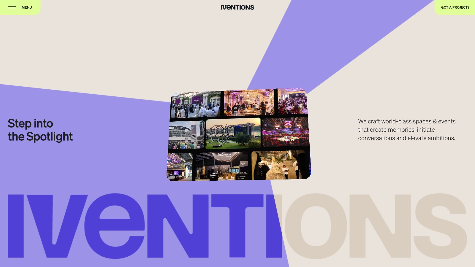
02 / 03 — Events · Spain · 2025
Iventions
Turning an event agency website into a digital stage.
A Three.js spotlight that lights, reveals and moves around each image — never on top of it — with the whole stage tuned to stay smooth on mid-range devices.
03 / 03 — Type & Motion · UK · 2025
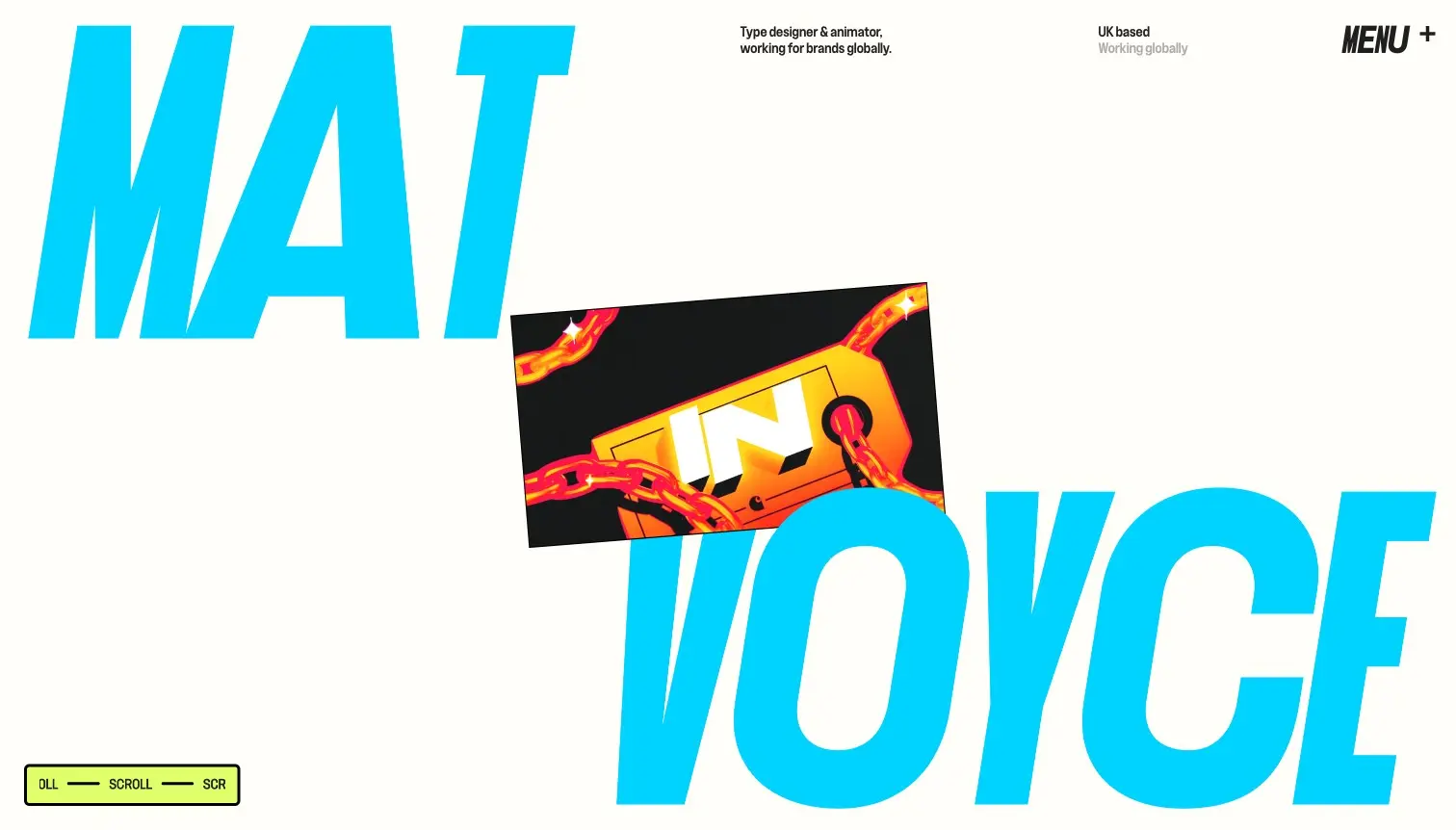
Mat Voyce
A portfolio that couldn’t sit still.
Type becomes interaction. Kinetic type animation engineered to stay fast, on a Strapi content layer.
07 — Motion philosophy
One layout · two states
Animation should explain hierarchy, state or movement — not just prove that animation exists.
Before — everything at once
Same duration, same curve, same start. Nothing tells the eye where to look first.
After — sequenced
The image opens the frame, the name follows it, support copy settles, the action arrives last. The order is the hierarchy.
08 — Performance
Same idea · different rendering budget
Same idea. Different rendering budget.
This device — measuring…
09 — Ways to work
Two routes into the same build
01 — Design ready
For studios, agencies, designers and teams with a completed design. The file gets built as designed — the motion, the WebGL, the CMS and the production work underneath.
02 — Need the full website
For founders and brands that need help before development starts. Design by Huy Phan, my design partner of seven years and an Awwwards jury member — then built by me.
10 — Typical build
An example scope, not a package
Flagship build — a couple of months
Bespoke templates, composed from one grid.
One timing grammar, not a pile of one-offs.
Your team edits content without a developer.
Re-composed for tablet and phone.
Only where they earn their weight.
Deployment, environments, SEO basics.
Real devices, frame budgets, accessibility.
Deploy, handover, documentation.
Scope is set on a short call — references, page count, motion depth and timing — and quoted as a fixed number, not a vague “it depends”.
11 — Trust
From a designer
“Have been working with Hon for the past 7 years on so many projects since I was just a new designer. All I can say that he's a dream for every designer. I always have some new challenges for him whenever we start a new project and he's always ready for them, solve them and translate my ideas into the real pixels correctly, often even better than I expected. Definitely one of the best full-stack developer out there. Recommend him for any website projects, from basic to high level of interaction and motion.”
12 — Start
Reply within 24 hours
Send the file, or start from a brief. Either way the first reply is a read on the hard part — not a template quote.