01
Directed motion
Every transition needs a reason: guide the eye, set the rhythm, hand over to the next project. Random animation would undercut a studio that sells intent.
01 / Selected work
Index 18 / 19
Creative Development · 2025 · Interiors, branding & graphic design studio
View live site02 — Why it existed
Context
By-Kin is a UK creative studio working across commercial interiors, branding and graphic design. Its whole product is judgement — what to keep, what to leave out, how a room should feel.
So the site couldn’t borrow a template’s confidence. It had to be quiet the way the rooms are quiet: one warm page, one orange, and motion that arrives only when it has something to say.
03 — The brief
01
01
Every transition needs a reason: guide the eye, set the rhythm, hand over to the next project. Random animation would undercut a studio that sells intent.
02
Interiors live or die on photography. No effect is allowed to soften, crop badly or slow down a hero image.
03
New projects and journal entries ship all the time, so everything runs on a headless CMS, never on a developer ticket.
04 — First encounter
Recorded on the live site
01 — First impression
The site opens by showing the work, not by describing it.
A stack of project photographs is revealed through a window that opens from the middle — inset(50%) to inset(0) over 1.6 s, power4.inOut. Each image settles from 1.2× to 1×, then the last three fly into the thumbnails of Featured works. The intro and the page share the same pictures.
05 — The idea
Creative logic
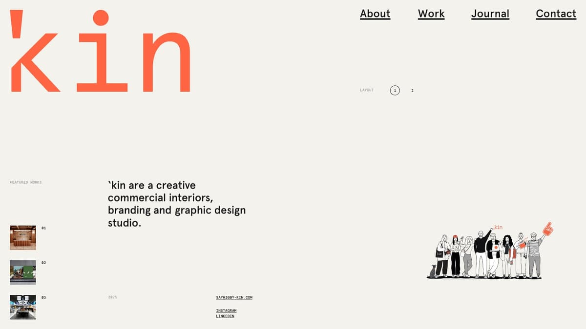
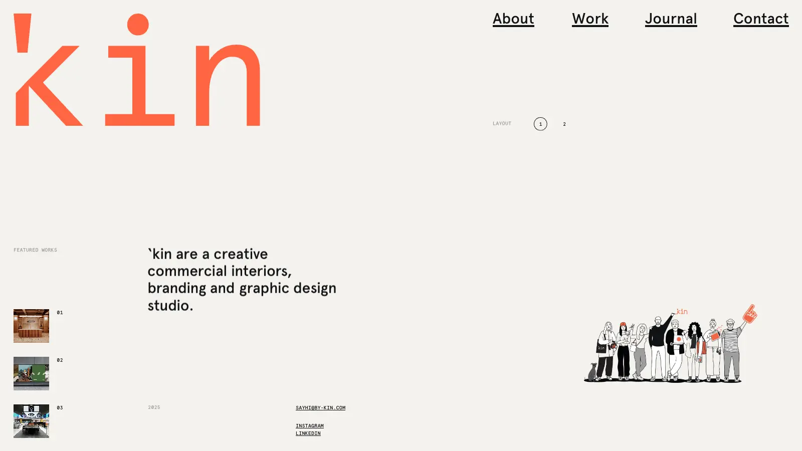
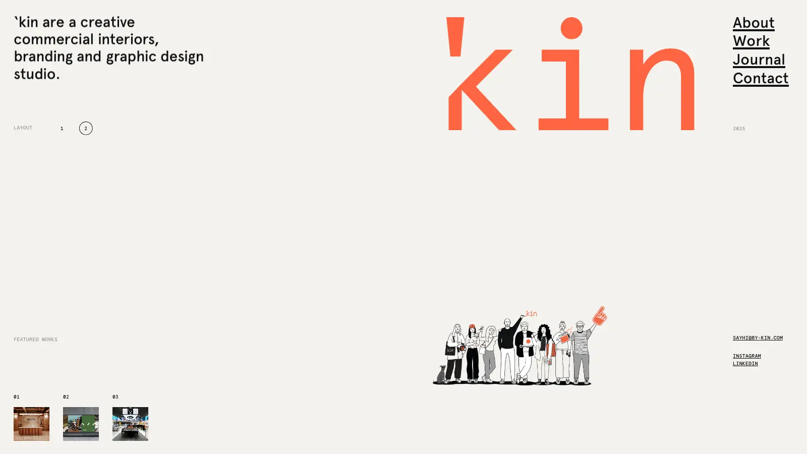
There is no scrolling on the home page. One viewport holds the studio, three featured projects and a team illustration, and a layout switch rearranges them.
The page changes shape; the content never leaves.
01 — Reveal
Project photographs open the page through one moving window.
02 — Land
The same photographs fly into the Featured works slots.
03 — Recompose
Layout 1 and 2 swap the whole composition in place.
04 — Leave
The ’kin mark carries the visitor to the next page.
06 — Motion system
Values from the source
07 — Inside the build
One site, five systems
Layer 00 — Surface
Move across the plate to X-ray it
An off-white page, one orange, Apercu Pro for reading and Apercu Mono for labels. Type does the layout.
One set of eases, one duration scale, state held in signals so a reveal never waits on a React render.
Lenis runs with autoRaf off and is stepped from the GSAP ticker; it stays stopped until the page is ready.
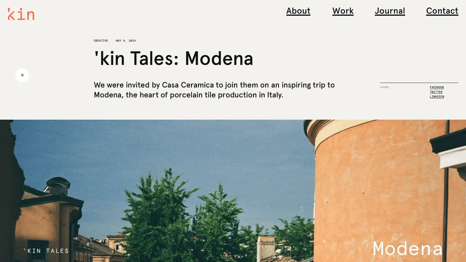
Every route change plays the ’kin mark in and out, and the next page only starts once the images above the fold have loaded.
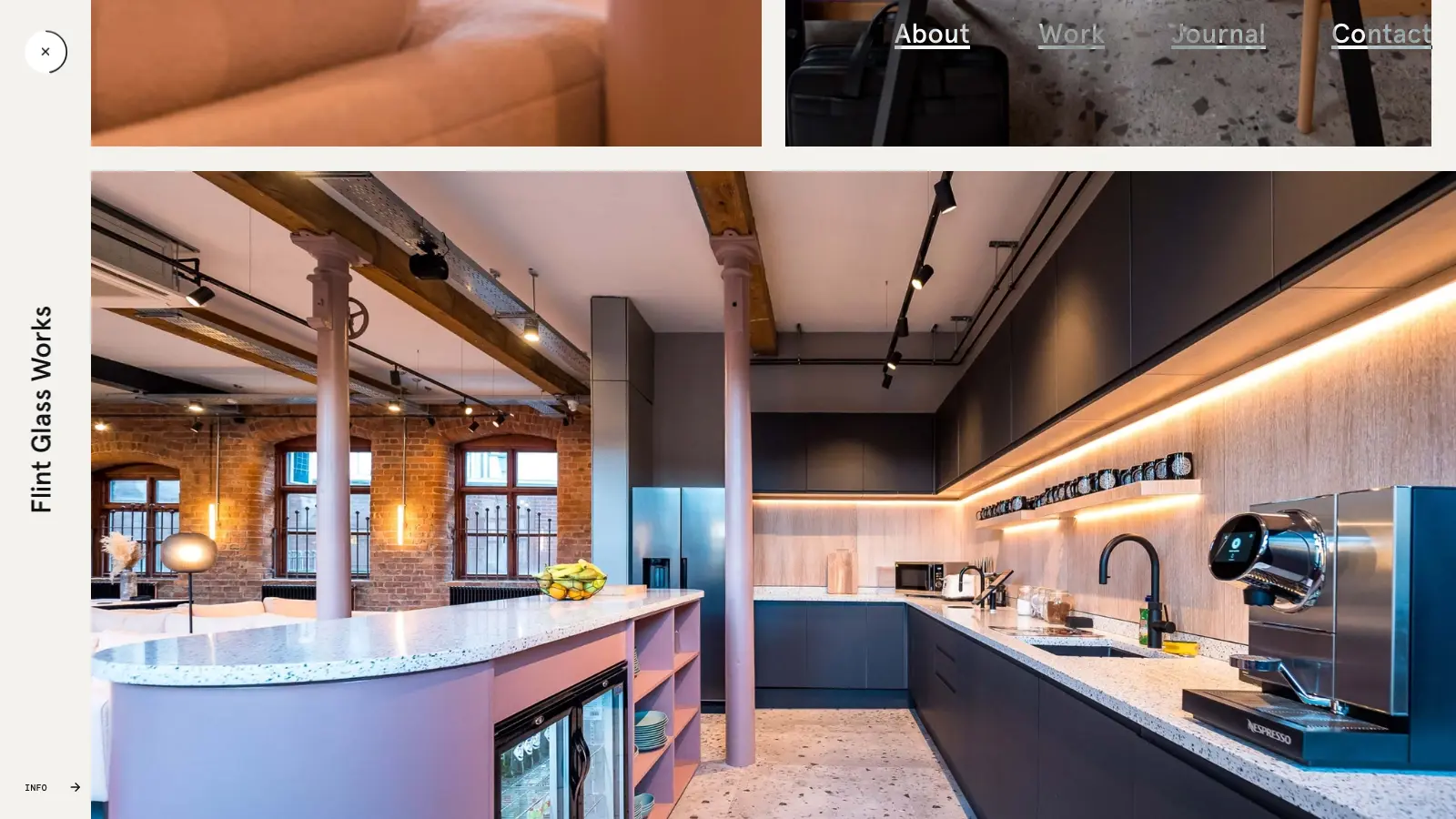
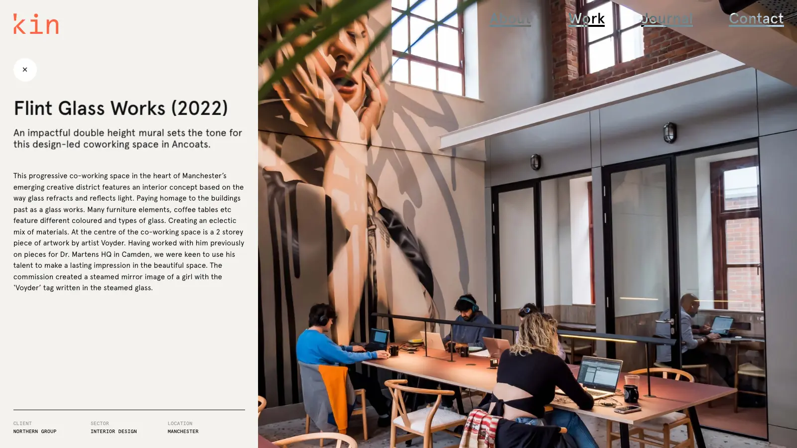
Projects, journal and pages are Strapi entries. A project gallery is a list of full-width and three-up rows the studio assembles.
08 — Signature interaction
Layout switch
The switch in the corner is the whole idea in miniature. On a pointer device you can click it, or hold the cursor on the ring: it fills over two seconds and then switches on its own. On touch it’s a plain tap.
Layout 1
Layout 2
09 — Responsive
Recomposed, not scaled
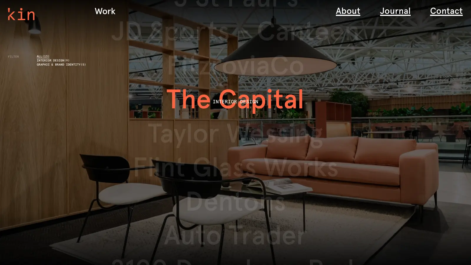
Desktop — the wordmark and the layout switch lead; the work list moves with the pointer.
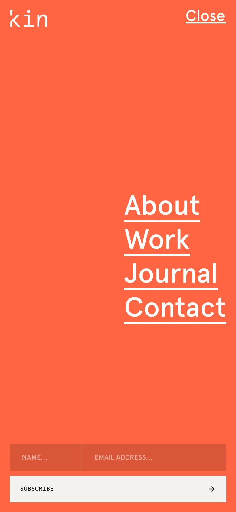
A sheet instead of four links, with the subscribe form inside.
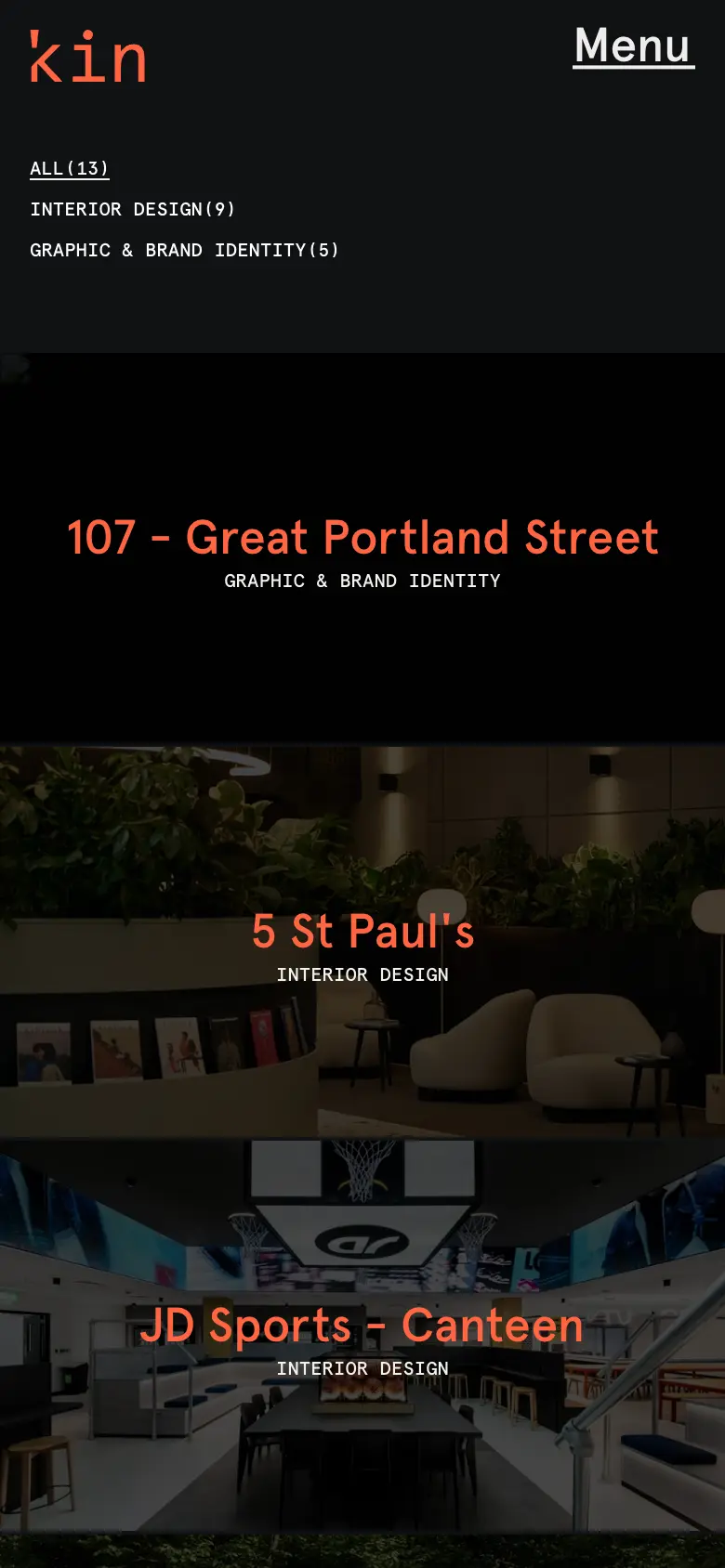
Names over photographs, one per row.
The layout switch skips its hover dwell on touch devices.
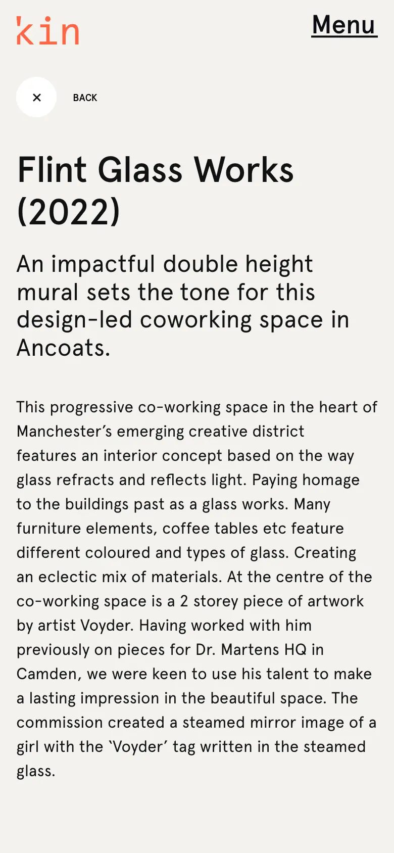
The project story first, then the rows of images.
10 — Performance
Decisions, not dashboards
No lab scores are shown here — none were measured for this page, so none are claimed. What follows are decisions that can be read in the code.
Each in-viewport image registers with a loader; the entrance only plays once they have landed.
Ticker loops attach when their element enters the viewport and detach when it leaves.
Lenis stays stopped until the page is ready, and its ticker callback is removed whenever it stops.
Sized per slot, with the full-bleed project images served by the Next image route.
11 — CMS
Entry ↔ live
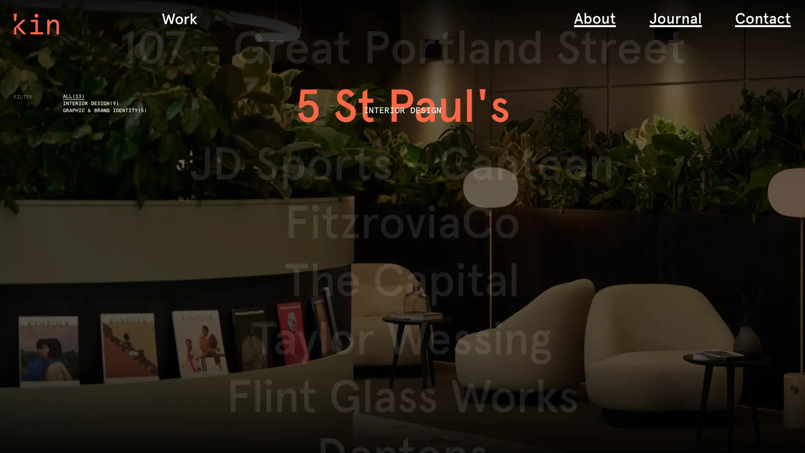
The studio adds projects, journal posts and the arrangement of each gallery on its own, in Strapi.
Content types
Covers
12 — The result
Evidence
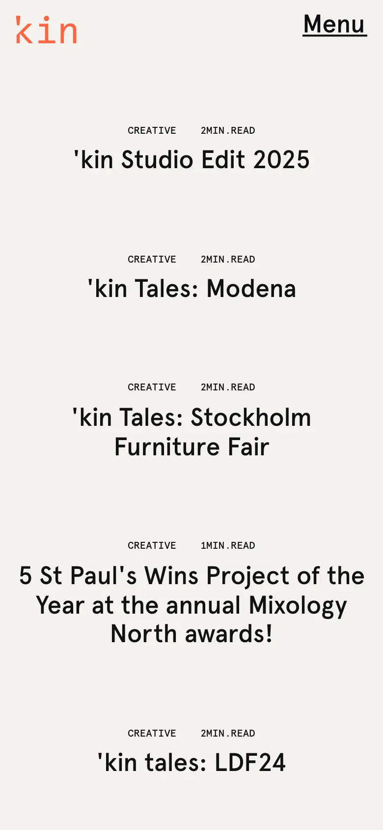
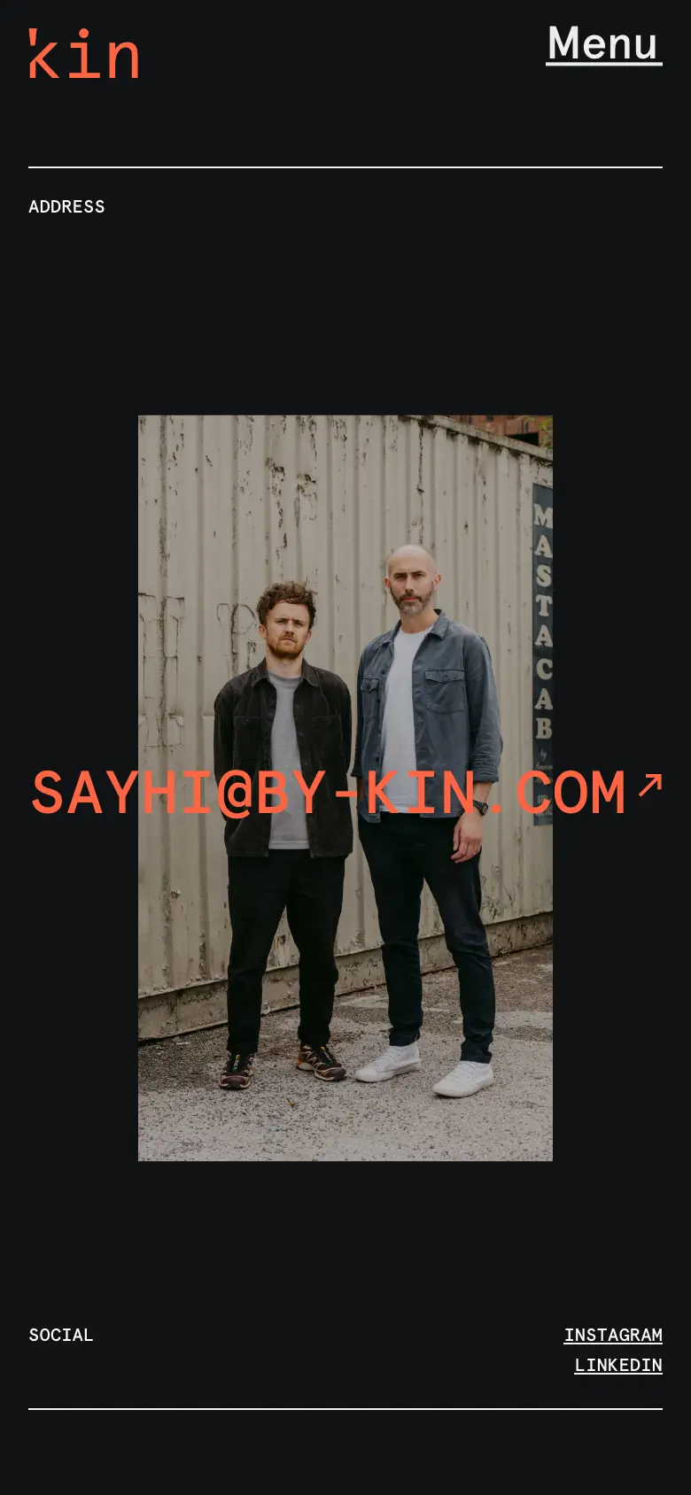
The site, screen by screen
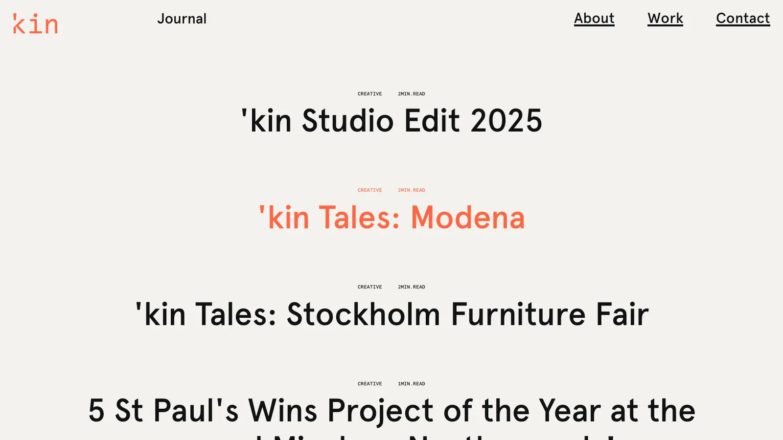
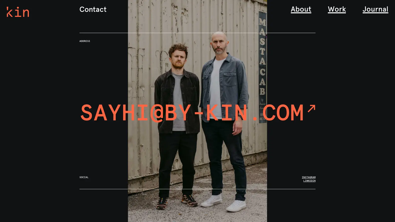
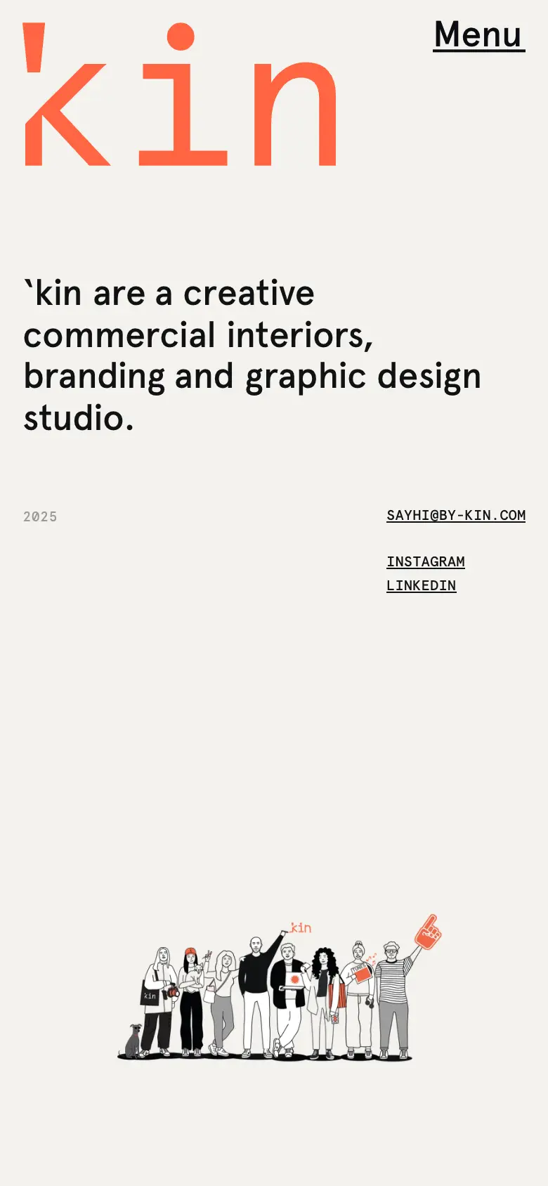
And on a phone
13 — Built together
Who did what
14 — My role
Exact responsibilities
Next.js app router pages fed by Strapi.
The intro reveal, fly-to-slot, list masks and page effect.
Lenis on the ticker, the pointer-driven work list, the layout switch.
Home, About, Contact, Work, Journal and project entries, including the gallery rows.
A separate phone composition for menu, work list and detail.
15 — Technical index
Hover a technology
16 — Build notes
Experience here · reasoning there
The thinking behind the build — the shared motion language, the Strapi layer, what the jury looked at.
By-Kin: an award-winning website case studyRecorded on the live site
Three moments, in motion
17 — Final experience
by-kin.comNext / 19
An immersive, award-winning home for a design studio.
Studio · Australia · 2025
19 — Start
Studios · brands · founders